|
|
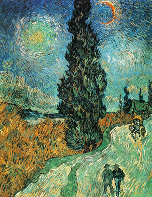
|
|

|
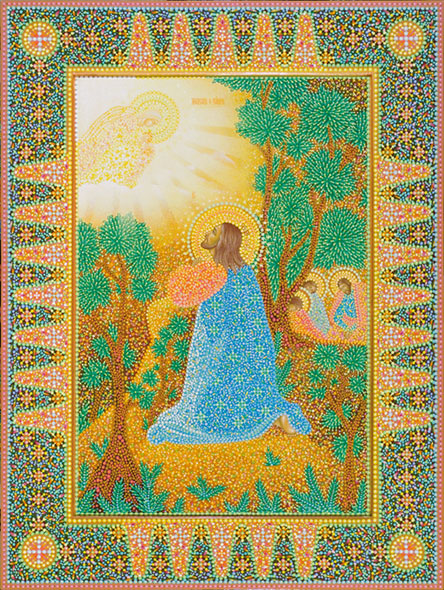
Spirited pointillism“To revive canonical Russian icons А. Yakimovich[1]
So what pointillism is? Why did Georges Seurat[3] think that this technique led to “interpenetration of all colours and shades in their pure form”[4], Camille Pissarro[5] call it “monotonic and dead points technique”[6], and does Yury Kuznetsov think that this technique helps icons to open “as much as he/she believes” to everyone? The devotee of pointillism progenitor, i.e. impressionism[7], Édouard Manet, Claude Monet, Camille Pissarro, Pierre-Auguste Renoir, Alfred Sisley and others in their strive to depart from “cleanliness” and excessive pedantism of academic pictorial art focused on the impression created by a nature. They were not interested in social and political scenes. They considered daily life sensations and emotions to be far more important. This was the start of works of arts unattached by compositions, easy-to-percept and unusually vivid. But the history of arts is not at a stop: a new style if it manages to maintain its position then it first gets prosperous, and afterwards it is sacrificed to a new style. Impressionism is not an exception. At the end of 1870-s, together with other French critics, Emile Zola[8] argued against “sketch incompleteness” of impressionism canvas[9]. It was an impetus for the young painter Georges Seurat to search for more expressive artistic language capable of embreathing pictorial art with new power of affection. “Fine art is harmony”, wrote Seurat. “Harmony is similarity of converse, similarity of similar elements of tones, colours, lines considered according to the dominant and under the influence of lighting, in joy, calm or sorrow.”[10]. In 100 years Yury Kuznetsov, an icon-painter from According to the icon-painter, he was greatly influenced by the reality. “Points are life episodes”, thinks Yury Kuznetsov. “They should not be mixed together; their prettiness is in their singularity”. Georges Seurat was influenced by researches of colours carried out by scientists, primarily by “Law on the difference in visual perception between a tone obtained as a result of optical colour mixing and physical pigments mix”[11] written by the professor of physics and weekend artist from New York Ogden Nicholas Rood (1831–1902) and the work written by Michel Eugène Chevreul[12] “About the law of simultaneous colour contrast”. The scientist formulated colour contrast law as follows: “Solar spectrum colours (there are three of them) which are called main ones – blue, red and yellow – when mixed, give rise to other, composite colours: when mixing blue and red, violet appears; mixture of blue and yellow gives rise to green; yellow and red are orange. The main colour not used in a composite one is its complementary colour. Thus, yellow is a complementary colour to velvet, red – to green, blue to orange, and vice versa. What is the history of the name “complementary”? The fact is that each colour paints anything it neighbours with: a yellow spot on white background adds a velvet note to whiteness. That is why two complementary colours placed near each other intensify each other. And vice versa, they faint and become expressionless when combined. On the other hand, a colour common for two paints is less intensive when compared to such two paints, for instance, violet and orange seem less red.<…> Thus, there is no colour proper, it exists only in relation to other neighbouring colours.”[13]. The last statement is of extreme importance. Yuri Kuznetsov says the same about our life episodes: they, like our deeds, exist only in comparison to each other. “For example, for an outstanding man to appear, a thousand of factors should coincide, sometimes these factors are very weird and unexpected! Wind needs to carry a seed to the place where the tree will grow; its bark will be the food for a hare which will be in the right time to run out to the road and attract young woman’s attention and she will not be hit by a car. And when she is a mother, she will bear a genius due to various conditions, both positive and negative.”
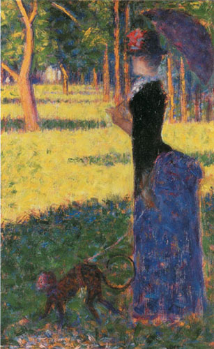
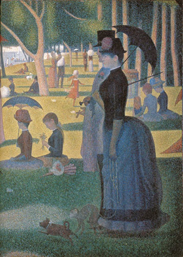
Georges Seurat did not think about our life complicacy as regards colours. He was interested only in the technique of decomposition of composite colour tones into pure colours which he could reflect in his canvas with clearly distinctive prismatic touches to be evenly applied on the canvas (Kuznetsov uses not touches, but round dots or lenses, of various sizes and overlapping). It is worth mentioning that Georges Seurat drew drafts of his canvas in impressionism manner! Compare the draft to the well-known “A Sunday Afternoon on the At the end of his life in his letter to Mourice Borbois Georges Seurat described in detail the technical aspects of his theory, “It is known that light effects the retina for some period of time resulting in synthesis. The expressive tool is optical mixture of tones, colours (a local colour and the colour of lighting: sun, oil lamp, gas, etc.), that is of various light and responses to it (shades) under the laws of contrast, gradation and irradiance.”[14]. Having any idea about such scientific explanations of optical colour mixing Yury Kuznetsov says, “The eye mixes colours to the level of prayer’s belief. The more the icon allows, the more a prayer sees.” The most important think for an icon-painter is the spiritual basis of any doing, that is why the ornament on icons painted by Yuri Kuznetsov is not just a basis for a pointillism painting, but also a “spiritual” frame arranging colourful dots and leaflets within colour planes. The similar analogy can be seen in construction as well: a building is erected using metal structures, and then hollow spaces are filled with concrete. Ornament helps to create an icon’s “body”, while points and leaflets animate it becoming an icon’s “soul”.
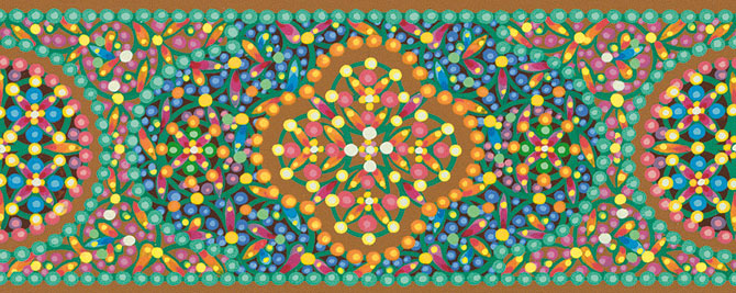
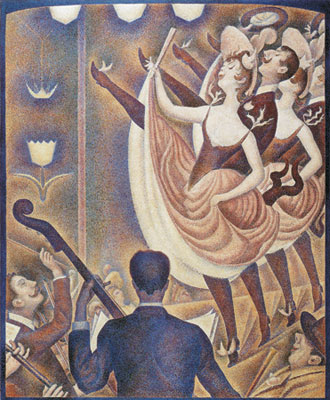
A frame, i.e. ornament of an icon can be of various types, “The leaflet sharpness influences the saint-to-be’s posture. Or it better to say, to the contrary, a saint’s life predetermines an ornament used. The key ornament organizing principle consists in conformation of an ornament used to a certain system of repetitions, incorporation of an ornament into a system organized according to the laws of symmetry. One may say that the level of ornament orderliness in Kuznetsov’s icons is of the utmost expressiveness that allows talking about new style emergence. The icon ornament has never played such an important role in prayer image depiction before. The distinctive feature of Kuznetsov’s style of painting is its universality: it helps in depicting any state, any image. For instance, for depicting Elijah the Prophet or Ivan the Warrior an austere ornament is used. Yury Kuznetsov thinks that the good has no sharp edges, that is why he rounds ornaments on his icons preserving their proportions and harmony.”[15]. Getting back to Seurat’s technique, I would like to mention that he possessed extensive theoretic knowledge on the laws of colour rendition and perception, but he failed to use them to animate his paintings. A picture is painted by heart and any logical elements (from head) add formality to it arousing no real delight. In 1890, at a regular exhibition of independent painters Seurat showed his painting where he tried to depict violent cancan motions. But the painter was trapped once again. It is not possible to depict motions with rough lines and frozen statures! The comments on the painting were far from being flattering, here is one of them, “Those who did not see Seurat’s painting with its beatifical dancers in pointes missed to see the entire extent of human descent.”[16] Or “It is logical, probably, overlogical!”[17] To be fair, let us say some words in defence of G. Seurat. He, like any path-breaker, experiments, through trial and error, and he will be unavoidably criticized. But if there were no creative courageous geniuses convinced about the need to move forward paying no attention to failures and sneer, there would not be any development and the new would never appear.
Icons are more austere: in order to create “contact” in front of icons, “one should stand lowly <…> and wait until they talk to us <…>, that is why an icon is more than fine art. To wait until it talks takes a lot of time, especially due to a long distance separating us.”[19]. But our patience will be rewarded. When an icon “talks”, a prayer will “have a piercing feeling of the spiritual world reality falling like a stroke, like a burn <…>. An icon is like a light, luminous seeing. <…> A seeing beyond anything <…> around, a seeing in its own space, in eternity. It calms down desires and fuss, it is perceived as something extra-restrial, topping our world and acting among us from out there.”[20]. I think that pointillism failed to develop in the beginning of the previous century as it did not have any clear objective: why do we use optical colour mixing? Undoubtedly, it helps to add more vividness, but it is not enough to bring a new style to life! Probably, if Seurat had not died so early (he was only 31), he would have gradually depart from naturalism in his works to symbolism. It is this transition undertaken by Yury Kuznetsov that saved pointillism. Yury Kuznetsov brought pointillism to artistic perfection and used it in the most symbolic art – in icon painting.
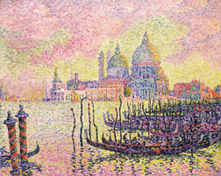
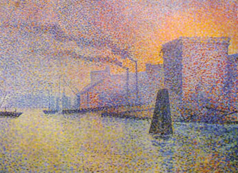
After Georges Seurat’s death, his closest immediate fellows in arms (Paul Signac, Cross, Theo van Risselberg, Maximilien Luce, Ptigane, Leo Gausson, Lucien Pissarro, etc.) were not ready to defend the divisionism ideas as they viewed this style more frivolously. Lucien Pissarro wrote to his father from
[1] A.K. Yakimovich, a Russian art expert, critic, historian, modern fine arts specialist, Doctor of art criticism, Active Member of the [2] Post-impressionism (Fr. postipressionisme) is a fine arts style that appeared in 1880s. The most prominent representatives of post-impressionism are Vincent van Gogh, Paul Gauguin, Paul Cézanne, Toulouse-Lautrec. [3] Georges Pierre Seurat (1859–1891), a French painter-post-impressionist, founder of neo-impressionism and the fine arts style called “divisionism”, or “pointillism”. [4] John Rewald. Post-impressionism, [5] Jacob Camille Pissarro (1830—1903), a French painter, one of the first and most adherent representatives of impressionism. [6] Henri Perruchot. Life of Seurst. М., 2001. P. 134. [7] Impressionism (Fr. impressionnisme, from impression — impression) is a fine arts style originating from [8] Emile Zola (1840–1902), a French writer, one of the most prominent representatives of realism of the second half of XIX century, the leader and theorist of the so-called “realist movement”. [9] Hajo Duchting. Georges Seurat. М., 2005. P. 7. [10] Henri Perrucho. Seurat’s life. М., 2001. Pp. 144–145. [11] Hajo Duchting. Georges Seurat. М., 2005. Pp. 31–33. [12] Michel Eugène Chevreul (1786–1889), a French organic chemist, foreign corresponding member of St Petersburg Academy of Sciences (1853). [13] Henri Perrucho. Seurat’s life. М., 2001. Pp. 14–15. [14] Henri Perrucho. Seurat’s life. М., 2001. Pp. 144–145. [15] К. Kondratieva. New icon-painting in [16] Henri Perrucho. Seurat’s life. М., 2001. P. 141. [17] Ibid. С. 142. [18] Vincent Willem van Gogh (1853–1890), the world-wide known Dutch painter post-impressionist. [19] E.N. Trubetskoy. Speculation in colours / Russian sacred art philosophy. М. 1993. P. 208. [20] P. Florenskiy. Iconostasis. М., 2009. P. 36. [21] Henri Perrucho. Seurat’s life. М., 2001. P. 158.
|